Visualising Death with Care
Originally posted as a thread on X.
A very thoughtful discussion about visualising death with Andy Kirk and Francis Gagnon on Clubhouse. Amongst many, the one takeaway that stuck with me is focusing on a percentage of people who have died in detail.
Where you see the lives of the people who have died, as opposed to a datapoint. Because if a small percentage is so powerful and overwhelming, you leave it to the reader to imagine what the true scale would feel.
And like many others, two projects that I have found powerful in visualising death:
1) Sonja Kuijpers’ A View on Despair — visualising suicide in the Netherlands.
Francis Gagnon paid special emphasis on a sense that leads the visual — “please scroll with regard.”
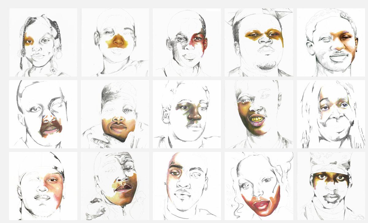
2) Adrian Brandon’s Stolen — “I want the viewer to see how much empty space is left in these lives, stories that will never be told, space that can never be filled.”