Information Design from the Early 2000s
My husband and I were watching a movie last night and went into a YouTube rabbit hole. My TIL moment was about Ceefax, a BBC teletext service that ran from 1974 to 2012. It was basically interactive TV before digital interactivity existed. You could flip through pages of news, weather, sports scores, stock charts, all on your television screen.
The reason I clicked on that thumbnail was this.
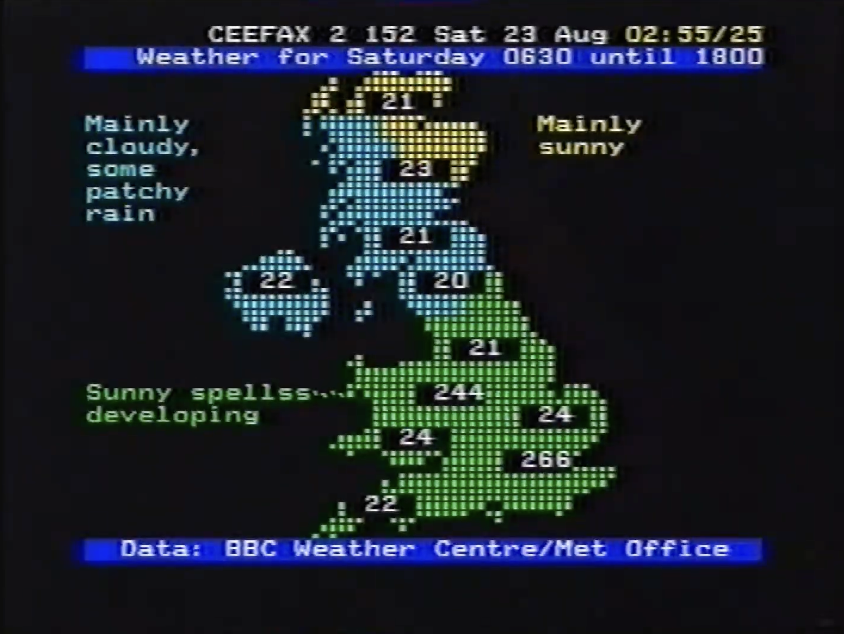
A dot-grid map of the UK. Blue for cloud, green for sun. “Mainly cloudy, some patchy rain.” Simple annotations, not busy at all. Primary colours on a black screen.
It is a weather map built from the most constrained medium imaginable. No fonts, no gradients, no smooth curves. Just a grid of blocky pixels. But I love it.
There is a charm to it that I cannot fully explain. Maybe it is the simplicity. Maybe it is the fact that somebody had to think very carefully about what to include when every pixel costs something. Maybe it is just that it looks beautiful in a way that most weather apps today do not.
That rabbit hole then led me to discover that someone has built a live Ceefax teletext experience you can actually use with current data.