Election Graphic Favourites from the 2020 US Election
Originally posted as a thread on X.
Some election graphic favs!
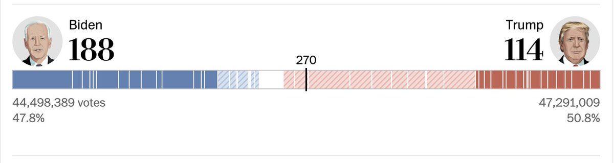
The way Bloomberg Visual Data has stacked the electoral college votes in their stacked bar.
Washington Post Graphics improves that by splitting up wins/leads!
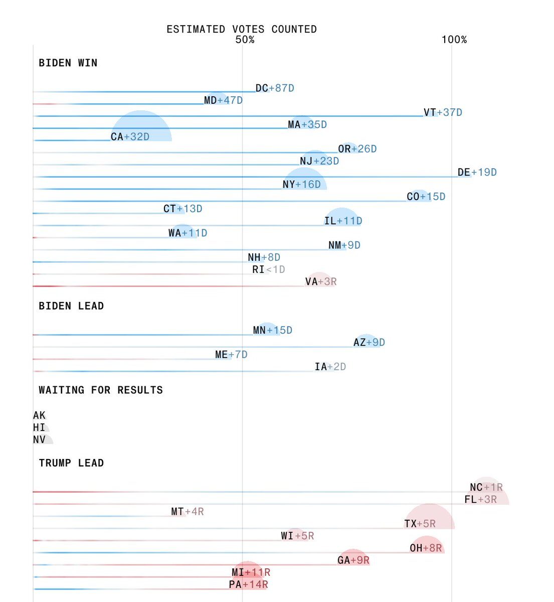
Bloomberg Visual Data’s focus on heatmaps of how leads change with the % of vote counted is another lovely element.
Also this chart with the same info.
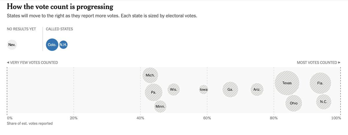
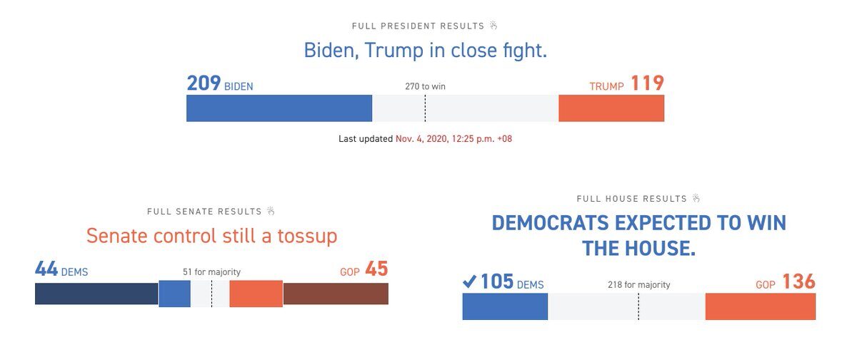
The New York Times tracks the same metrics in a different style.
These headlines with the stacked bars on Politico.
Election 2020 results in ten languages by my Reuters Graphics colleagues!
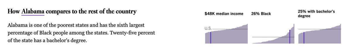
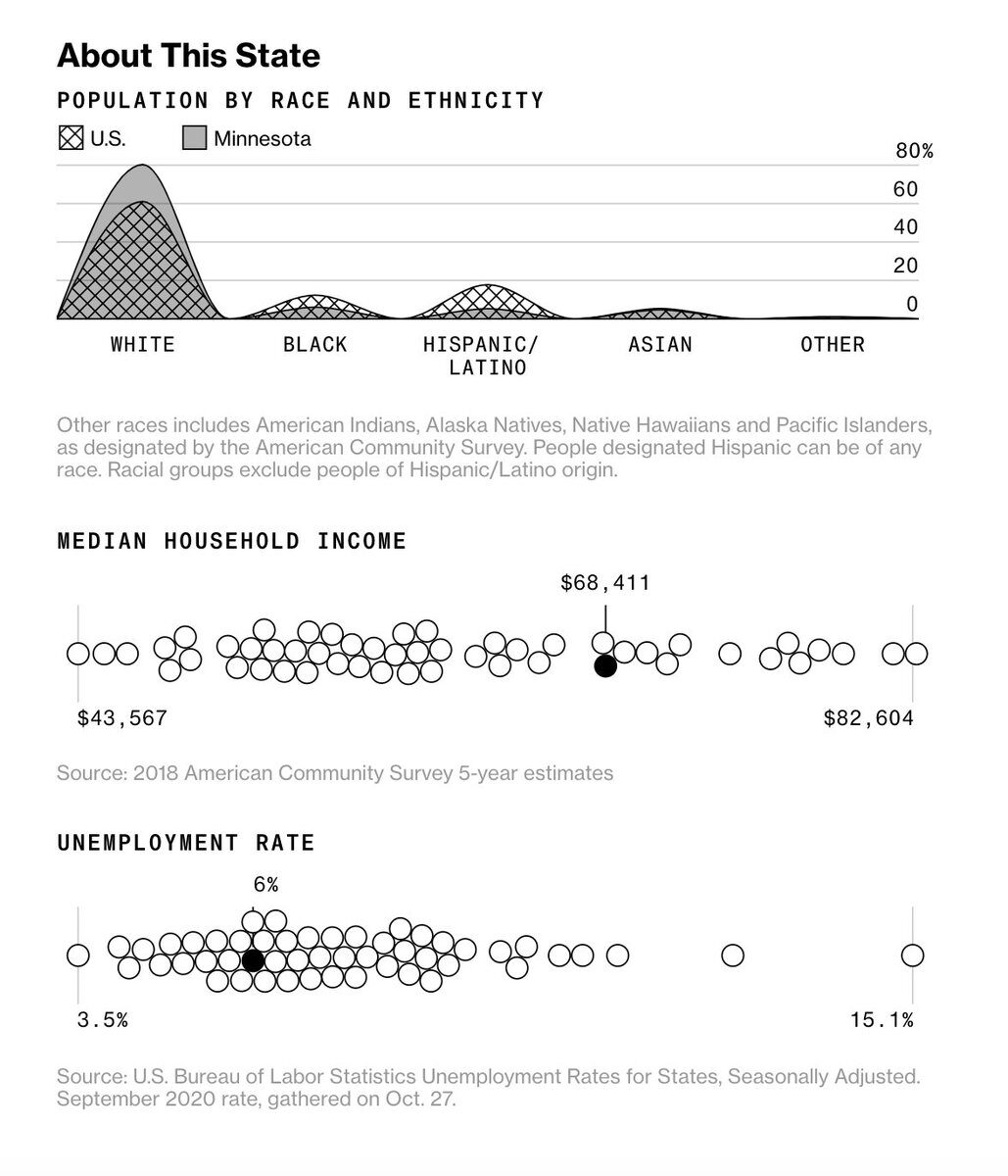
These state election comparison charts from the LA Times.
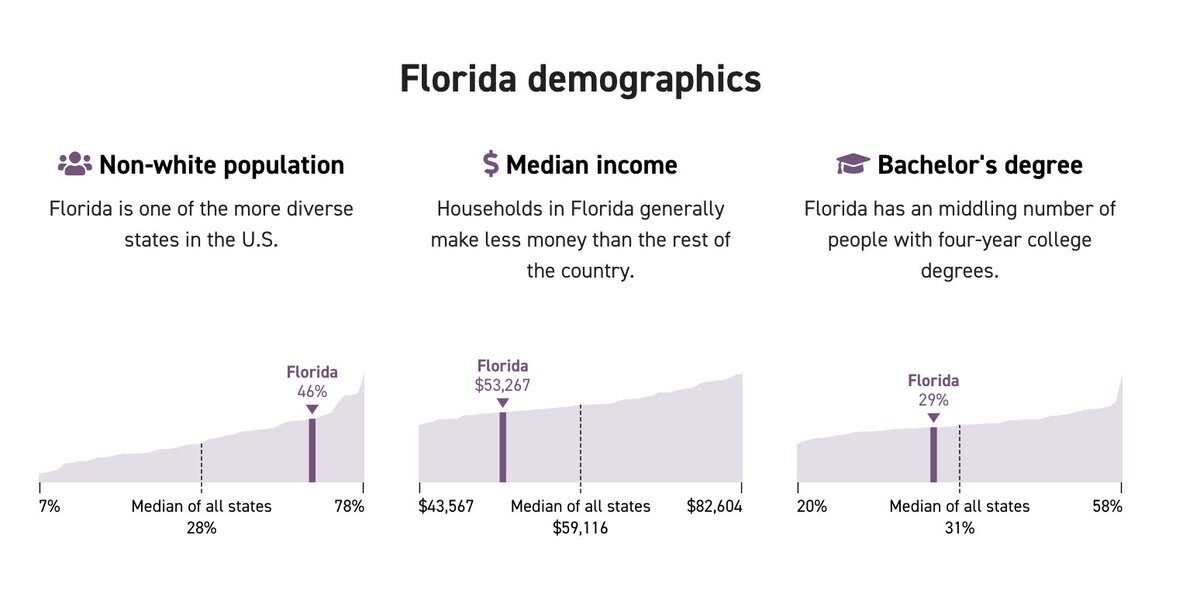
And from Bloomberg Visual Data.
This state selector for toss-up states by FT Data.
The classic Chris Canipe seamless state to county transition.
This log as states are called by Guardian Data.

I don’t generally like pie charts, but I kinda dig this very compact way to show what % of expected votes are left in states that have not been called. (The AP embed as seen on The New Yorker.)
The ticker on the WSJ mobile homepage.
The legendary, age-old NYT Graphics path to victory.
More demographic comparisons on Politico.
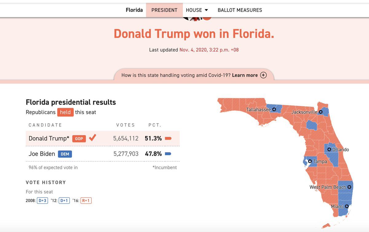
This tiny vote history element on Politico.

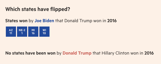
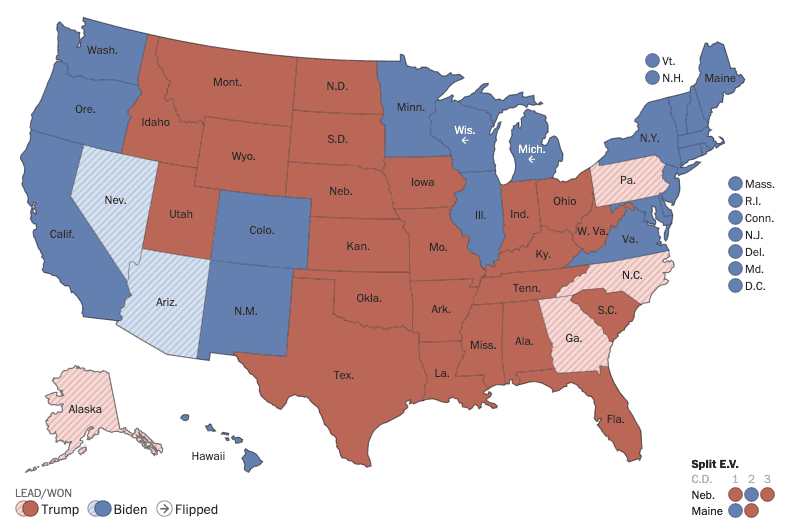
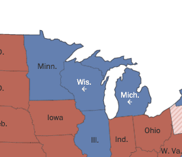
These subtle arrows on the Washington Post’s map to show the flipped states.
Or just in a good old line as done by the FT folks.