Interactivity as a storytelling tool in data visualisation
This post is adapted from a talk I gave at IIT Guwahati in September 2024. The framework I use here comes from a paper I really like — “Communicating with Interactive Articles” by Hohman, Conlen, Heer and Chau (Distill, 2020). If you’re interested in the theory behind interactive storytelling, I’d highly recommend reading it. I’ve taken their framework and filled it with examples — some from my own work, some from newsrooms and practitioners I admire.
But first — what do these words mean?
The title of the talk was “Using interactivity as a tool for storytelling in data visualisation.” That’s a lot of words. Let me break them down.
Interactivity — I do something, and something changes. Two-way communication. Not a static page where you passively scroll. The reader has agency.
Storytelling — Turning information into a narrative. Making it relatable for the audience. Not just showing data, but shaping it into something that lands.
Data visualisation — Images that represent data. Easy to understand and comprehend. The visual encoding of information.
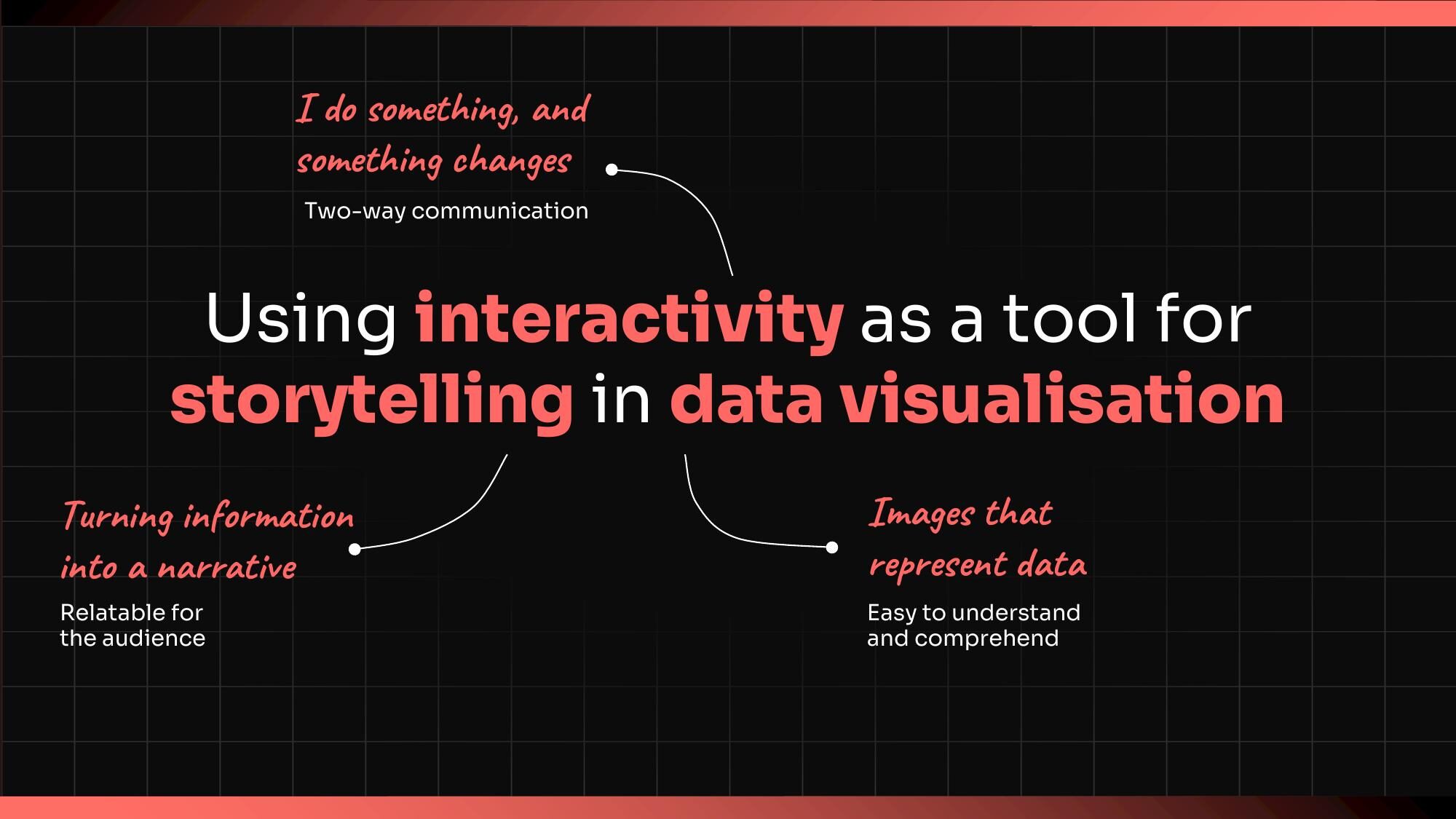
When these three come together, something interesting happens. The reader isn’t just looking at a chart. They’re inside a story, and their actions shape how that story unfolds.
What interactive storytelling can do
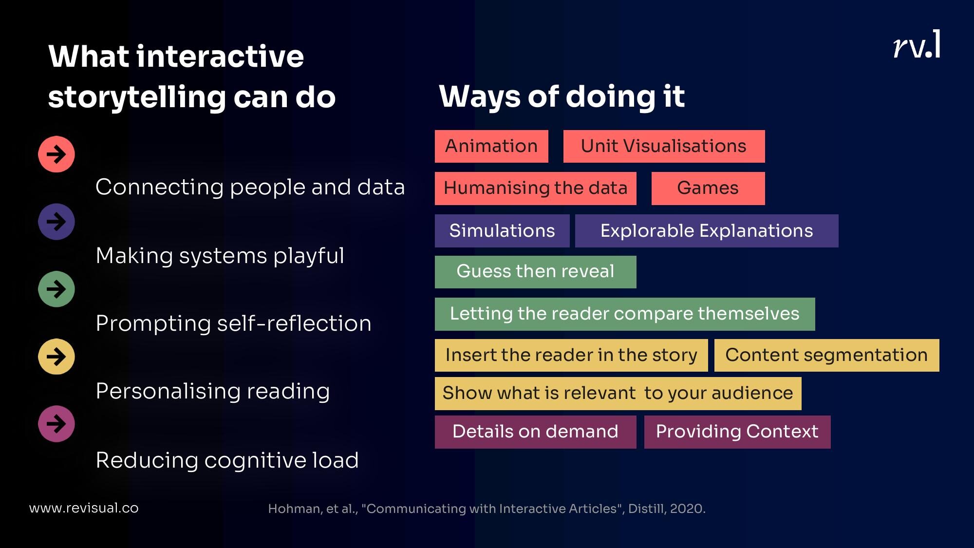
Hohman et al. identified several things that interactivity enables in communicating with data. I’ve been thinking about these as a practitioner and want to walk through the ones that resonate most with my work, organised into five buckets:
- Connecting people and data
- Making systems playful
- Prompting self-reflection
- Personalising reading
- Reducing cognitive load
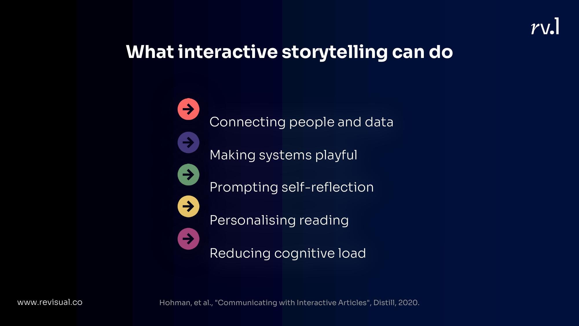
Let me take each one.
1. Connecting People and Data
This is the most intuitive function of interactivity — bridging the gap between abstract numbers and something a person can feel.
Animation
Animation creates state transitions. It shows change happening, not just the before and after. It’s useful for showing uncertainty, causality, and constructing narratives that unfold in time.
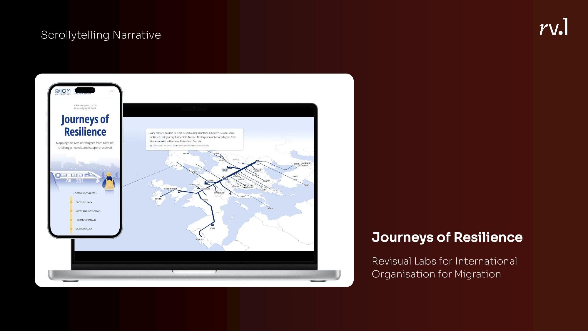
Scrollytelling narratives like our Journeys of Resilience project for IOM use scroll position to pace a story. As you scroll, the narrative unfolds — maps shift, numbers build, context accumulates. The reader controls the pace but the author controls the sequence.
Stepper narratives give more explicit control — step 1, step 2, step 3. I used this format at the Hindustan Times to show every country’s fastest man in one race. Each step added a runner.
Ed Hawkins’ climate spirals are a masterclass in animation — the same data that would be a static line chart becomes viscerally alarming when you watch it spiral outward year by year.
Unit Visualisations
There’s something about seeing individual marks — dots, icons, blocks — that changes how you feel about data. A bar chart says “15,000 people died.” A field of 15,000 dots says something different.
FiveThirtyEight’s Gun Deaths in America is the canonical example. Each dot is a person. They fall into the frame, accumulate, and then get filtered by age, gender, intent. The data is the same as a table would contain. The experience is not.
Humanising the data
Related but distinct from unit vis — this is about putting individual stories, faces, or voices into the data.
The New York Times has done this beautifully with their COVID death counts — not just numbers, but names, ages, descriptions of who these people were. The Pudding’s work on anxiety collected actual quotes and opinions, making the reader feel surrounded by other people’s experiences.
Games
Push interactivity far enough and you get games. The narrative moves from author-guided to reader-driven. You’re no longer reading a story; you’re playing one.
The Financial Times explained the gig economy with a game where you play as a delivery rider, making decisions and experiencing the consequences. Vox made a game about the college scholarship system that was equal parts fun and depressing.
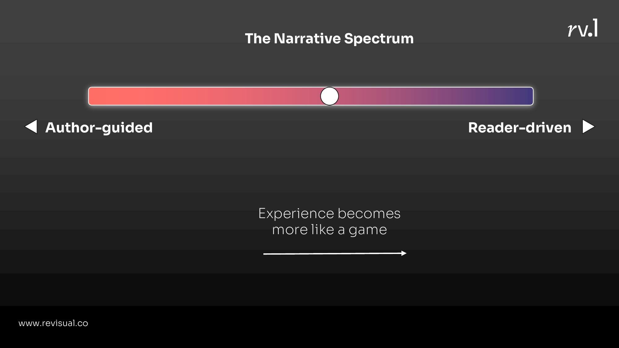
The narrative spectrum
There’s a spectrum here: on one end, the author guides everything (scrollytelling). On the other, the reader drives everything (games). The experience becomes more game-like as you move toward reader-driven. Neither end is inherently better — the right choice depends on what you’re trying to say.
2. Making Systems Playful
Some stories aren’t about data points. They’re about systems — how things connect, spread, compound, interact. Interactivity is uniquely powerful here because systems are dynamic, and static graphics can only show one state.
Simulations
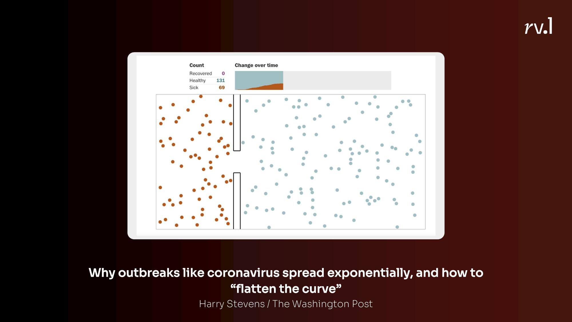
The Washington Post’s flatten the curve piece in March 2020 was probably the most important data visualisation of the decade. It didn’t use real data. It simulated how diseases spread under different conditions — no intervention, some distancing, full lockdown. You watched the dots bounce around and infect each other. You understood exponential growth not because someone explained it, but because you watched it happen.
Explorable Explanations
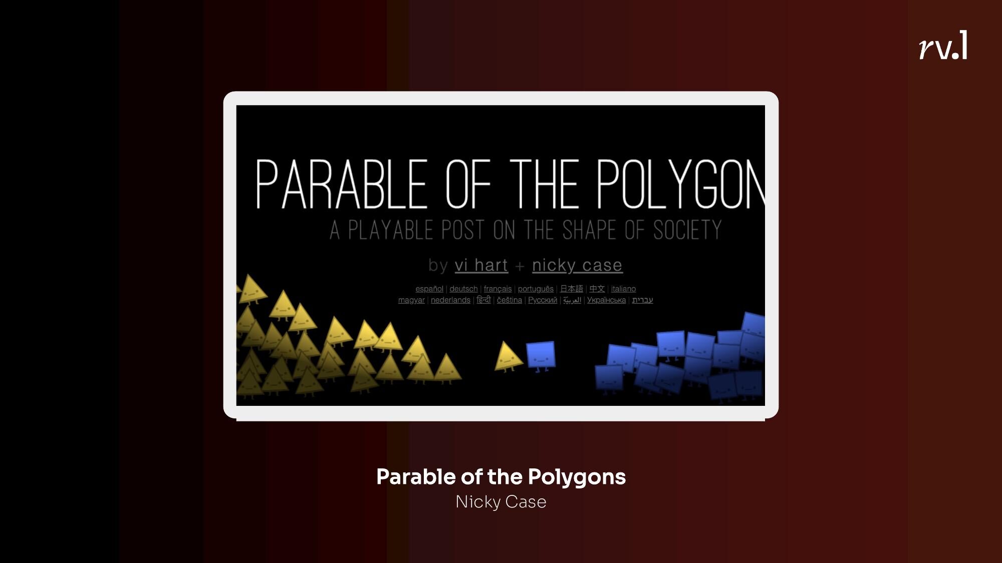
A step beyond simulations — explorable explanations let you manipulate the variables and see what happens. Nicky Case’s Parable of the Polygons lets you adjust a simple preference slider — “I want to be near at least a third of people like me” — and watch how mild individual preferences produce severe systemic segregation. You don’t read about it. You cause it.
My colleagues Manas Sharma and Simon Scarr at Reuters built an explorable explanation about stopping the spread of COVID that followed the same principle — understand the science first, then play with the variables.
3. Prompting Self-Reflection
This might be my favourite category. Instead of telling you something, the interactive asks you something — and your answer becomes part of the experience.
Guess then reveal
The New York Times’ “You Draw It” series is the best example. You’re asked to draw what you think a trend looks like — the drug overdose epidemic, for instance — and then the real data is revealed on top of your drawing. The gap between your guess and reality is the story.
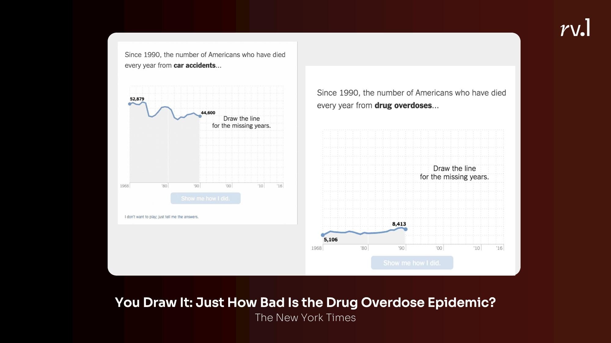
This works because of the “testing effect” — you learn more when you’re actively trying to answer a question than when you’re passively reading an answer. It turns the reader from a consumer into a participant.
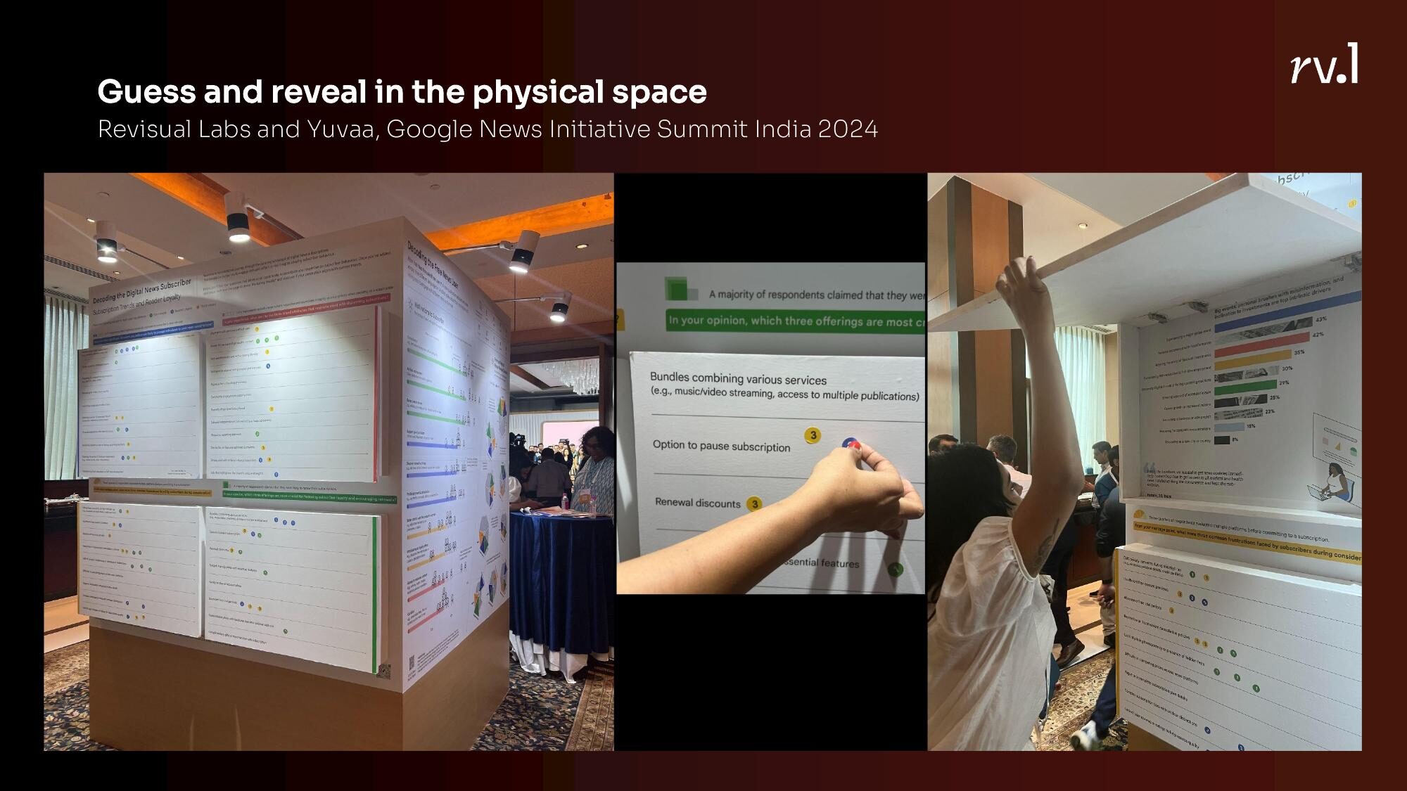
We’ve experimented with this in physical space too. At the Google News Initiative Summit in India, Revisual Labs and Yuvaa created a physical guess-and-reveal installation — people drew their estimates on paper before the real data was shown.
Seeing how you compare
Wordle did this brilliantly with its stats screen. After you finish, you see your distribution of guesses and how you compare with the global average. The Communal Plot by PerThirtySix does something similar with daily polls — you answer, and then you see where you fall relative to everyone else.
The insight here is that people care deeply about where they stand. Give them a way to see themselves in the data, and engagement follows.
4. Personalising Reading
Closely related to self-reflection, but the mechanism is different. Here, the content itself changes based on who you are.
Insert the reader in the story
The Washington Post asked: “What would Bloomberg’s half-billion dollars in campaign spending cost you on your budget?” You enter your income, and the equivalences are recalculated for your life. Suddenly, abstract political spending becomes concrete — it’s the equivalent of you spending ₹400 on a cup of chai.
The New York Times’ How Much Hotter Is Your Hometown asks for your birth year and your city, and shows you how temperatures have changed in your lifetime, in your place. Climate change stops being a global abstraction and becomes your experience.

Show what is relevant
Ed Hawkins’ Climate Stripes — and the related Air Quality Stripes — let you select your city or country and see your stripe pattern. The design is identical for everyone, but the data is yours. India’s air quality stripes look different from Norway’s. Delhi’s look different from Chennai’s.
Content segmentation
Long, complex content can be broken into segments that the reader navigates at their own pace. Quantum Country’s approach to explaining quantum computing — where the article periodically quizzes you on what you’ve read — treats interactivity as a memory aid.
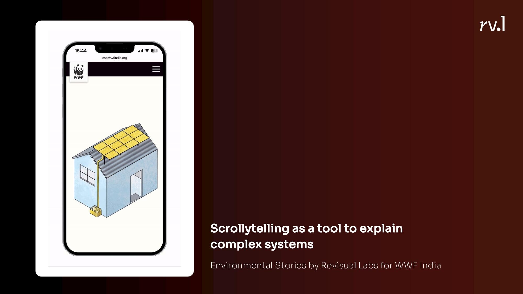
Our Journeys of Resilience project for IOM used scrollytelling to segment a complex migration story into digestible chapters. Our environmental stories for WWF India did the same — scrollytelling as a tool to explain complex systems one layer at a time.
5. Reducing Cognitive Load
Sometimes the best use of interactivity is simply to show less. Not everything at once. Only what’s needed, when it’s needed.
Details on demand
Tooltips. Expandable sections. Click-to-reveal. The principle is simple: show the overview first, let the reader drill into details when they want to. This is the bread and butter of dashboards.
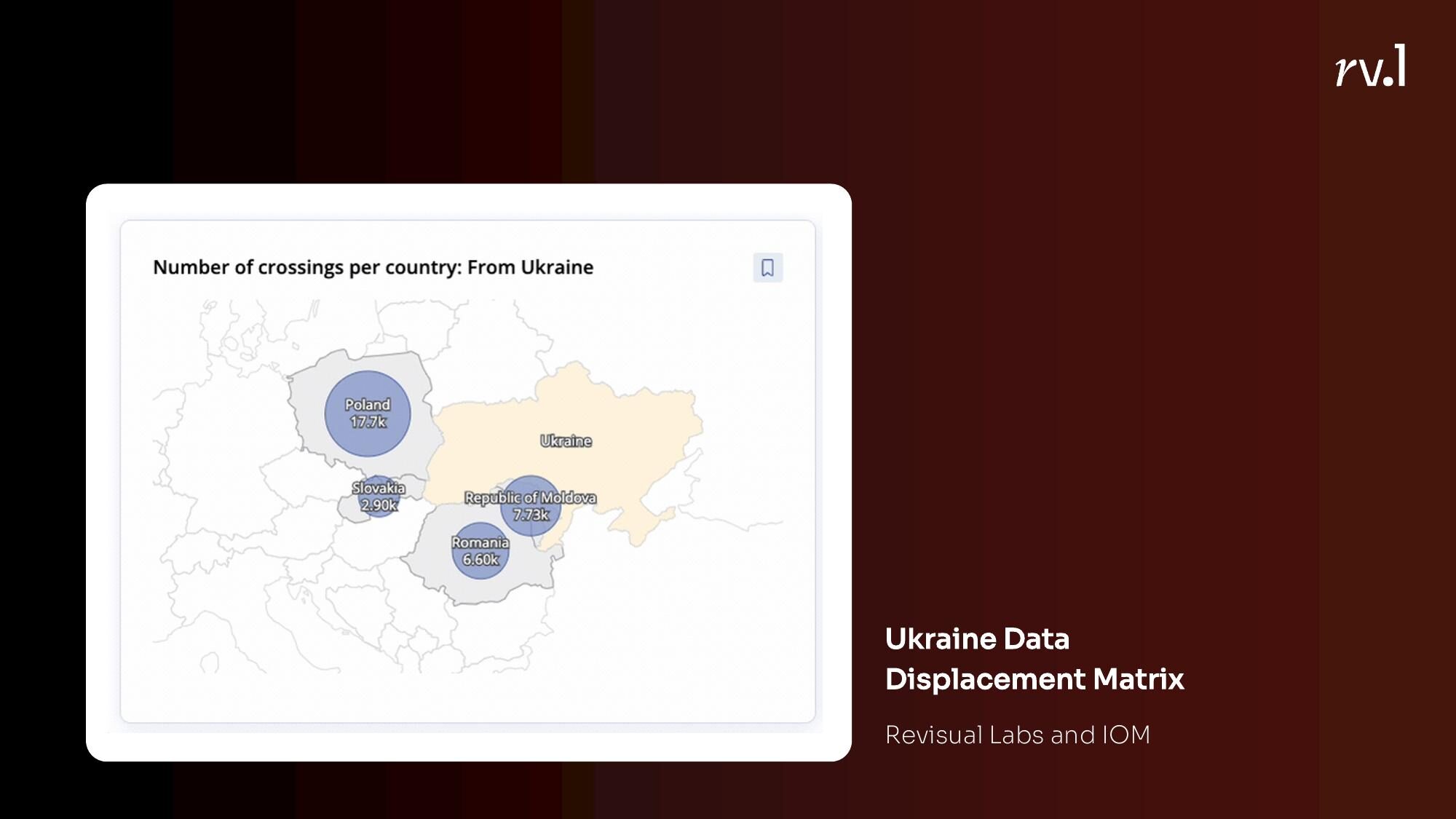
Our migration dashboards for IOM — the AP Migration Dashboard and the Ukraine Regional Response Dashboard — use this heavily. The overview map shows the big picture. Click a country, a region, a site, and the detail unfolds.
The Pudding’s piece on the inferiority of women’s pockets lets you explore individual jean brands and pocket measurements — but only when you want to. The narrative doesn’t force you through every data point.
Providing context
Hans Rosling’s bubble charts encode four or five variables at once — position, size, colour, and the animation of change over time. The interactivity adds an additional encoding dimension that a static chart simply cannot carry. Amelia Wattenberger’s PenPal tool takes a similar approach — using interactivity not for exploration but for layering context.
The Reuters COVID Vaccination Tracker used interactive context to let readers compare their country’s progress against others — not just showing the number, but showing what that number means.
Putting it all together
None of these techniques are new. Scrollytelling has been around for over a decade. Unit visualisations have been around longer. What is useful is having a vocabulary for why we’re using interactivity — not just “because we can” or “because it looks cool,” but because we’re trying to connect someone to data, make a system playful, prompt self-reflection, personalise their reading, or reduce the load on their brain.
The next time you’re deciding whether a story should be interactive, don’t start with the tool. Start with the function. What do you want the interactivity to do for the reader? The answer will tell you which technique to reach for.