Creating responsive data visualisations
Presented for Hasgeek’s Content Web series, this talk listed down 10 tips for creating responsive visualisations.
An important part of my job is crying about different screen sizes. They make my job much harder, something I blissfully ignored when I started out.
My first published interactive at Poynter was an iframe hosted on Github pages. I had no understanding of design, forget responsive web design.
Even the initial data visualisations on the web, that places like NYT and Reuters built, were essentially made just for desktop screens. This is less than 10 years ago, so we need to understand that all of this is super new.


Tip #1: Tweak the treatment based on the screen
Flat map on desktop, globe on mobile
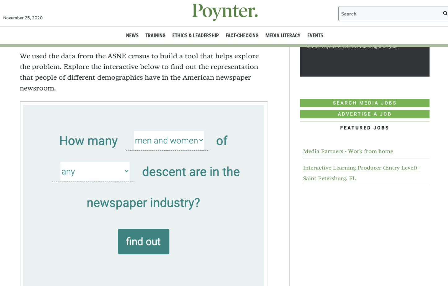
People on desktop, bars on mobile
Small multiples on desktop, toggle on mobile

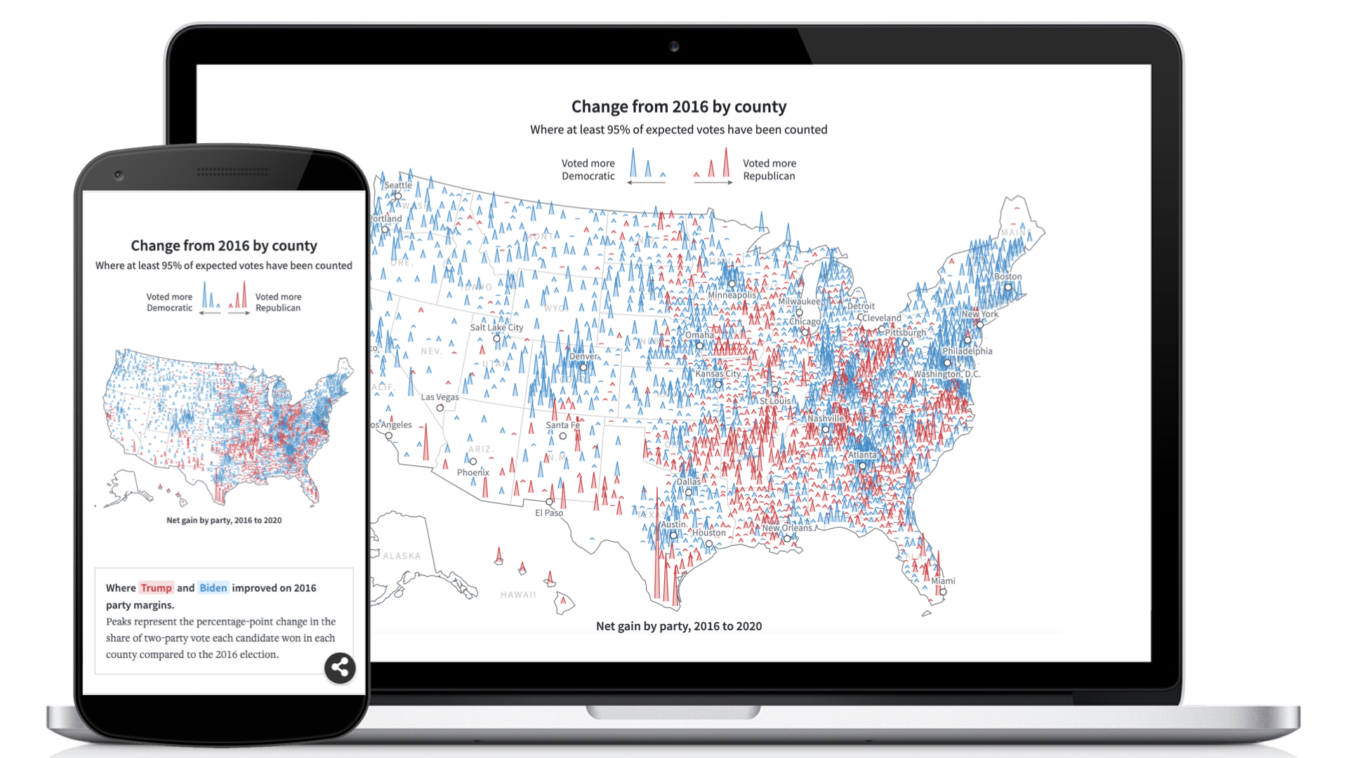
Tip #2: Flip it!

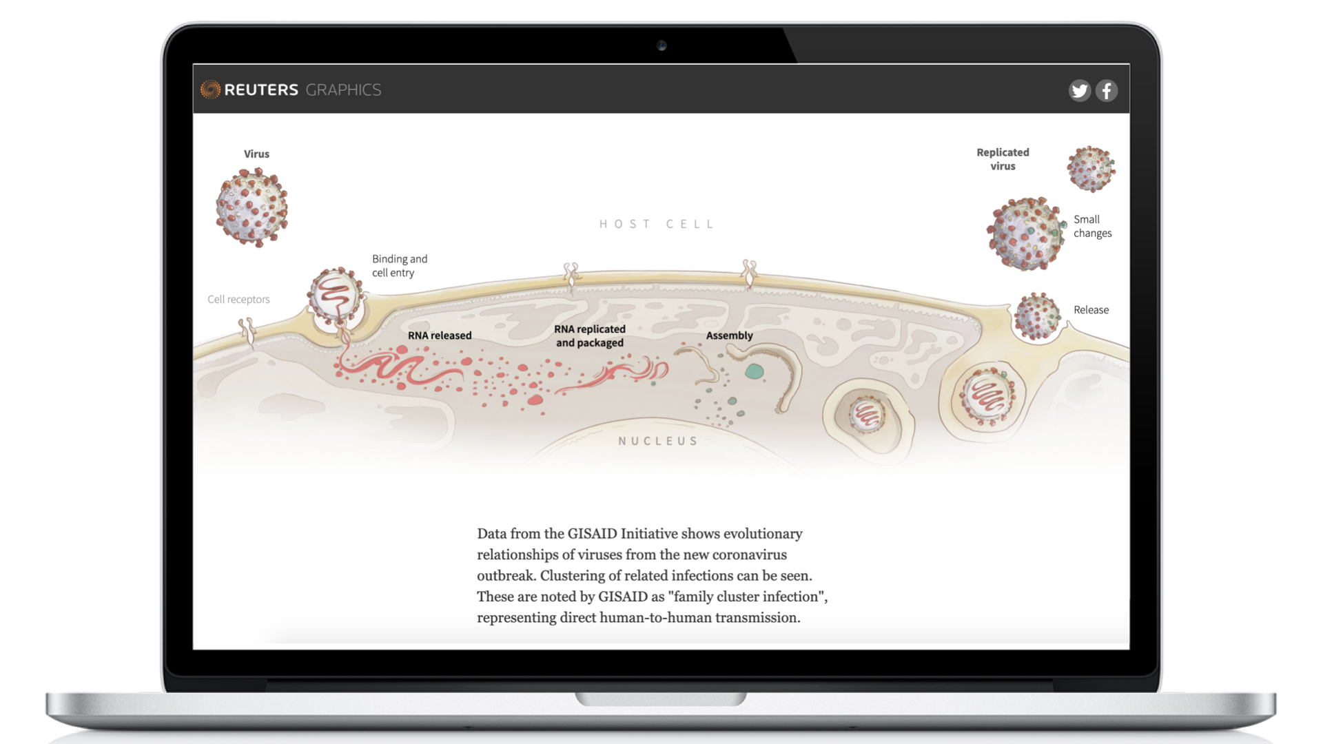
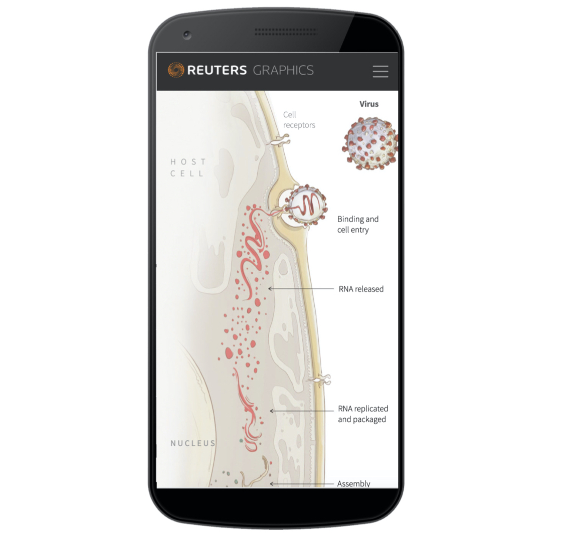
Tip #3: Use subtle design changes to make things more readable
For this map driven peace about Joe Biden’s victory in the 2020 Elections…

Our map has these very nice state and city labels.

We removed them on mobile because there is no way they would have been legible.
Tip #4: Make UX changes based on the device
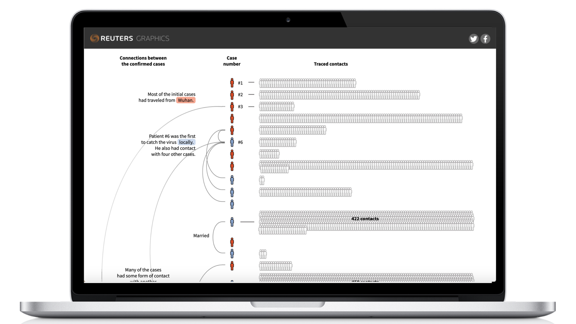
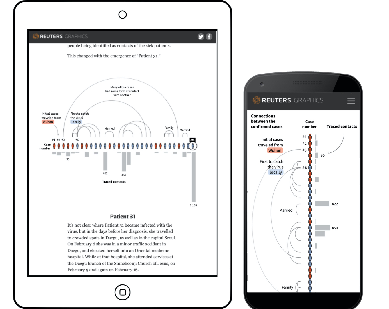
In our coronavirus tracker, we have a world map showing where different countries are with respect to their own pandemic. Because of the nature of the world map, it looks good on desktop.
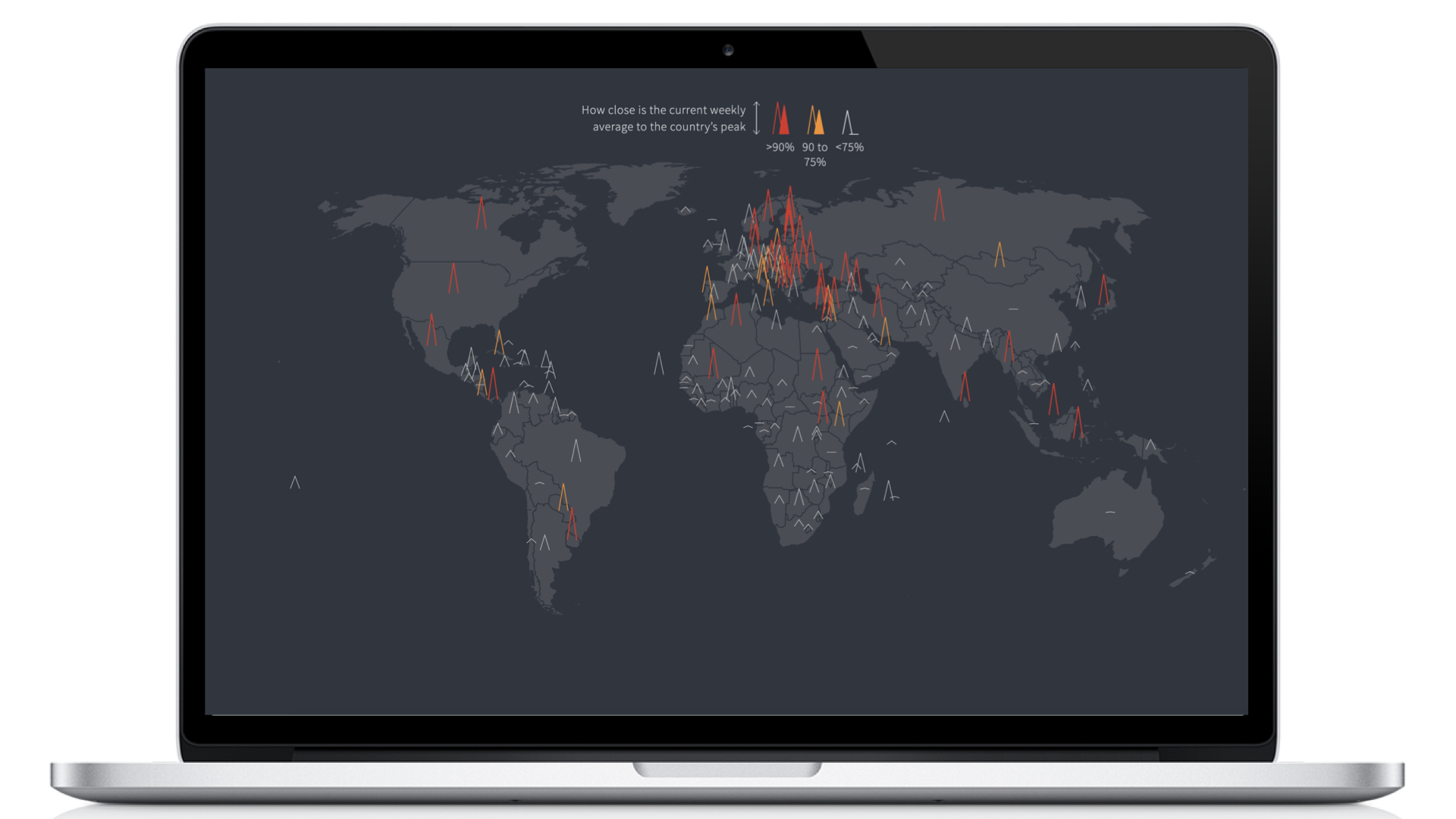
But if I translate the same thing to mobile, this is what my map would look like. I know, pretty awful.

To solve that problem, on the suggestion of my colleague Prasanta, we created an interaction with an inset.
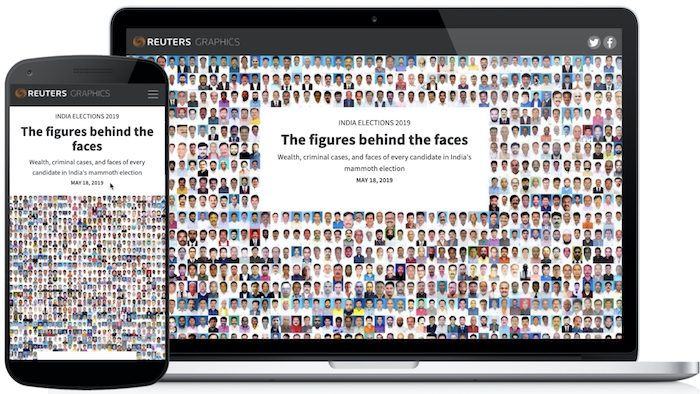
Tip #5: If it works on mobile, it works on desktop
For our live India elections tracker, except for the position of a tooltip, everything was exactly the same across screen sizes.
This long scroll driven story had the same thing - because it was a static story, entirely the same across screen sizes.
My first published D3.js project was the same! Exactly the same no matter what the device.
Tip #6: Be selective with interactivity. Interaction is expensive and comes at a cost.
This story about Lata Mangeshkar’s career has lots of svg elements (5000+) moving around on scroll. That is a heavy interaction. The performance can be improved by using canvas/WebGL, but at the time of making this, I knew neither. While the svg elements move well on desktop and maybe a high-end iPhone, a lower end phone clearly struggles.
Tip #7: Static visualisations are great!
We use a lot of ai2html to do static visualisations. It takes away the need to write a lot of word to do responsive viz without taking away the power of good design.
Tip #8: Exploit the scroll
“Scrolling is especially good for narratives because it is linear: you can only scroll in one dimension.” - Mike Bostock
Scrolling is perhaps the most intuitive interaction on a phone. So exploit that. It is also translatable to a bigger screen. As in this piece about the Australia bushfires.
Tip #9: Don’t hide information in tooltips, use annotations for context
Annotations are great! Tooltips with fat fingers on a phone are not going to be super accessible. So if you want the reader to know something, tell them, and don’t hide the information behind a tooltip.

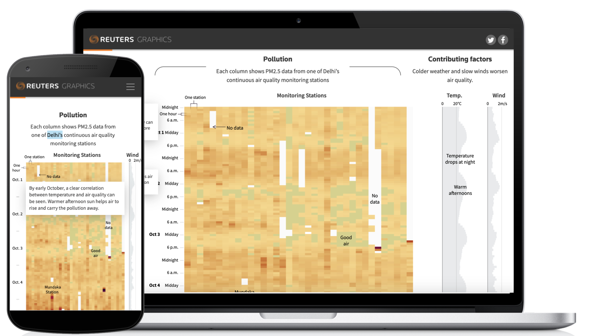
Tip #10: mobiles are a great lesson in editing. help you focus on what is most important.
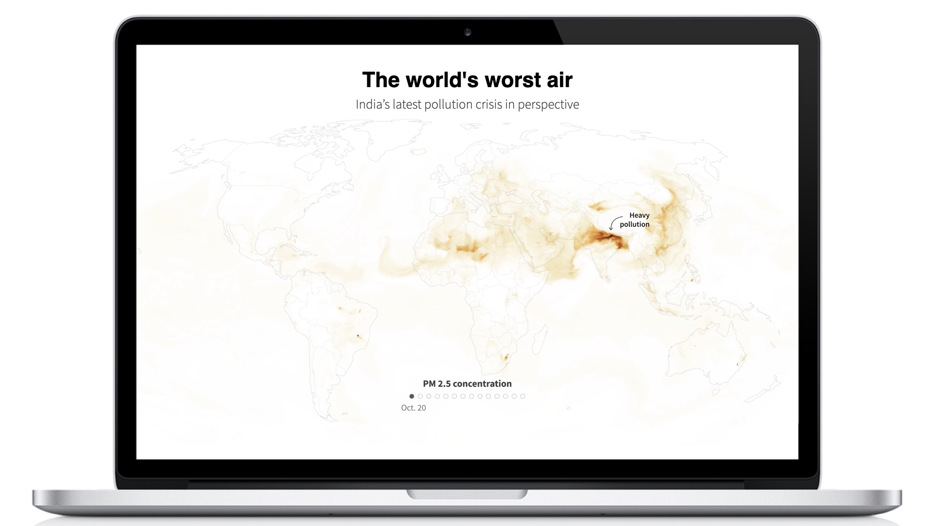
For this piece about pollution we showed temperature and wind on the desktop next to pollution levels. But on mobile because of the lack of real estate, we just showed wind. Lesser space forced us to limit ourselves to the most important elements of the viz.
And to recap…
Ten tips for responsive data viz
- Tweak the treatment based on the screen.
- flip it.
- Use subtle design changes to make things more readable.
- Make UX changes based on the device.
- If it works on mobile, it works on desktop.
- Be selective with interactivity. Interaction is expensive and comes at a cost.
- Static visualisations are great!
- Exploit the interaction of scroll!
- Don’t hide information in tooltips, use annotations for context.
- Mobiles are a great lesson in editing. Helps you focus on what is most important.
Three tools that are helpful when thinking of responsive visualisations:
- D3.js - draw the custom viz live on the page, letting you take the dimensions from a container and drawing it based on that.
- ai2html - make static visualisations in Illustrator for different screensizes and port it to the page.
- pym.js - script to have responsive height in iframes.
If you want to watch the full length recording of the talk (it was roughly 1.5 hours with Q/A), you can do so below!